Energy Strips Coffee Alternative Ad Template - Square
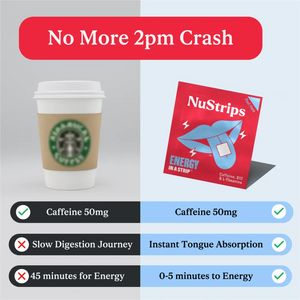
This square comparison ad template is built for a fast-acting energy supplement such as caffeine “energy strips” positioned as a smarter alternative to an afternoon coffee. The design uses a clean spl...
Free for 7 days — Cancel anytime
About This Template
This square comparison ad template is built for a fast-acting energy supplement such as caffeine “energy strips” positioned as a smarter alternative to an afternoon coffee. The design uses a clean split-screen layout: a takeaway coffee cup on the left versus a bright red product sachet on the right, immediately setting up a side-by-side choice. A large rounded red headline bar (“No More 2pm Crash”) grabs attention, while three checklist rows deliver scan-friendly proof points: same caffeine dose, faster absorption, and quicker time-to-energy. The mix of soft grey/blue backgrounds with high-contrast red accents keeps the message bold without feeling cluttered. Strategically, this is a mid-funnel consideration creative aimed at solution-aware users who already want energy but dislike the post-lunch slump. Convenience, speed, and curiosity are reinforced through clear “X vs ✓” visual cues. Brands can customize by swapping the competitor image (coffee/energy drink), adjusting dosage claims, and replacing the packshot, icons, and colors while preserving the comparison structure that makes benefits instantly credible.


