Nootropic Supplement Comparison Ad Template - Square
This square ad template promotes a focus and mental-performance supplement using a clean “swap what you’re using” comparison concept. Across the top, three familiar options are listed—Adderall, coffee...
Free for 7 days — Cancel anytime
About This Template
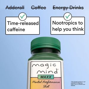
This square ad template promotes a focus and mental-performance supplement using a clean “swap what you’re using” comparison concept. Across the top, three familiar options are listed—Adderall, coffee, and energy drinks—visually crossed out to spark curiosity and position the product as a smarter alternative. Two bold white info cards with green check icons highlight concrete benefits (“Time-released caffeine” and “Nootropics to help you think”), turning abstract claims into quick, scannable reasons to believe. The design is minimalist and high-contrast: a light blue background, black typography, crisp bordered boxes, and a centered product bottle shot anchoring the layout. This structure fits mid-funnel consideration: the viewer already wants better focus/energy, and the template guides them toward a solution by reframing competing habits and introducing differentiators. Aspirational cues (clear thinking, sustained energy) reduce perceived risk while the small disclaimer area supports compliance. Customize by swapping the crossed-out comparators (e.g., “pre-workout,” “afternoon crash”), adjusting benefit cards to match your formula, and replacing the bottle render with your packaging and brand colors while keeping the simple icon-card system for readability.


