Longevity Supplement Drink Curiosity Ad Template - Square
This square supplement ad template is built for a longevity/healthy-aging drink and uses a curiosity-first headline to stop the scroll: “The drink every mum should be taking by 50.” The layout is clea...
Free for 7 days — Cancel anytime
About This Template
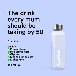
This square supplement ad template is built for a longevity/healthy-aging drink and uses a curiosity-first headline to stop the scroll: “The drink every mum should be taking by 50.” The layout is clean and high-contrast on a soft periwinkle background, with a bold black sans-serif headline stacked on the left and a minimalist bottle packshot on the right. A “Contains” section with green check icons lists key ingredients (NMN, pterostilbene, hyaluronic acid, glycine, magnesium malate, L-theanine), adding immediate specificity and credibility without overwhelming the viewer. The composition signals modern wellness and premium simplicity, ideal for top-of-funnel awareness where the audience may be “unaware” but open to aspirational health upgrades. This approach works because it combines a clear target persona (mums approaching midlife) with ingredient-led intrigue, encouraging clicks to learn what the formula does. Customize by swapping the bottle label, updating the ingredient list to match your formula, and adjusting the headline to different life stages or segments (e.g., “busy professionals,” “active 40+”).


