Beef Organ Supplement Comparison Ad Template - Square
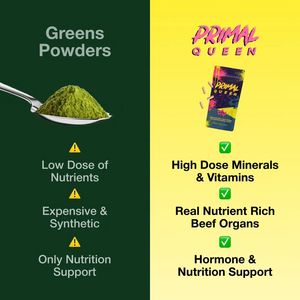
This square supplement ad template uses a bold comparison layout to position a beef organ nutrient product as a stronger alternative to “greens powders.” The canvas is split vertically: a deep forest-...
Free for 7 days — Cancel anytime
About This Template
This square supplement ad template uses a bold comparison layout to position a beef organ nutrient product as a stronger alternative to “greens powders.” The canvas is split vertically: a deep forest-green panel on the left features a spoonful of green powder and warning icons paired with short drawback statements, while a bright yellow panel on the right highlights the hero packshot with high-contrast benefit bullets and green checkmarks. Typography is large, clean, and stacked for fast scanning, making the message legible even on mobile feeds. Strategically, this creative leans on curiosity and authority at the consideration stage: it frames a clear “this vs that” decision, suggests clinical-sounding advantages (high-dose minerals/vitamins), and reinforces value by calling out expense and synthetic ingredients on the competitor side. For solution-aware shoppers comparing supplement categories, the side-by-side structure reduces cognitive load and creates a decisive visual argument. Customize by swapping the packshot, replacing claims with compliant benefits, and adjusting the left/right competitor framing (e.g., collagen vs gummies) while keeping the high-contrast split that drives attention.


