Electrolyte Stick Pack 30-Day Results Ad Template - Story
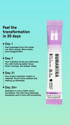
This 9:16 Story ad template is built for a single-serve electrolyte stick pack or hydration powder mix. A clean aqua-to-mint gradient background keeps the message fresh and “wellness” coded, while a b...
Free for 7 days — Cancel anytime
About This Template
This 9:16 Story ad template is built for a single-serve electrolyte stick pack or hydration powder mix. A clean aqua-to-mint gradient background keeps the message fresh and “wellness” coded, while a bold, black headline (“Feel the transformation in 30 days”) anchors attention immediately. On the left, a timeline format breaks benefits into Day 1, Day 7, Day 21, and Day 30+, each with short, scannable paragraphs and bullet dots that guide the eye downward like a progress tracker. On the right, an oversized product shot of a purple-and-white stick pack provides instant category recognition and credibility (with icons for electrolytes, zero sugar, and immunity support). Strategically, this is mid-funnel consideration for solution-aware shoppers: it doesn’t explain what electrolytes are; it visualizes a realistic ramp-up of outcomes (energy, clarity, focus, sleep, reduced cravings), using transformation and routine-building triggers. Brands can customize by swapping the stick pack render, changing the day milestones to match clinical claims, and recoloring the gradient to align with flavor or brand palette while keeping the high-contrast typography for readability.


