Probiotic Capsules Comparison Ad Template - Story
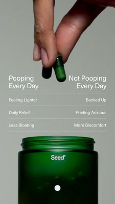
This 9:16 Story template is built for a digestive-health supplement, specifically probiotic capsules, and uses a blunt side-by-side comparison to drive consideration. The top of the design features a ...
Free for 7 days — Cancel anytime
About This Template
This 9:16 Story template is built for a digestive-health supplement, specifically probiotic capsules, and uses a blunt side-by-side comparison to drive consideration. The top of the design features a close-up hand holding two dark-green capsules, immediately signaling “real product” and creating curiosity. Below, a clean two-column table contrasts outcomes of “Pooping Every Day” vs “Not Pooping Every Day,” with short, scannable benefit/pain statements separated by thin divider lines. The lower third anchors the message with a large, premium-looking dark-green jar shot on a light gray background—minimal, clinical, and trustworthy. Strategically, it combines relief and comparison triggers: viewers recognize the discomfort (bloating, anxiety, backed up) and can quickly map the product to a desired routine outcome. This is ideal for MOF/solution-aware audiences who already want gut support and are weighing options. Customize by swapping the jar and capsule colors to match your packaging, replacing the row copy with your brand’s verified benefits, and adding a stronger CTA button in the empty space above the product for higher tap intent.


