Intimate Wellness Capsule 4-in-1 Formula Ad Template - Square
This square supplement ad template is built for women’s intimate wellness capsules and leans into an “ingredients + benefits” consideration-stage message. The top headline stack uses strong hierarchy—...
Free for 7 days — Cancel anytime
About This Template
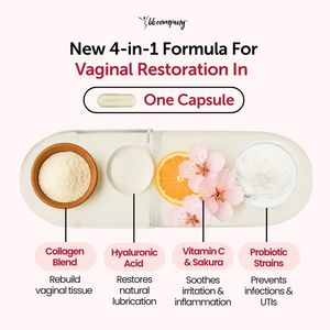
This square supplement ad template is built for women’s intimate wellness capsules and leans into an “ingredients + benefits” consideration-stage message. The top headline stack uses strong hierarchy—black support text, a bold burgundy keyword line, then a pill-shaped callout reading “One Capsule”—to quickly communicate the promise of a simplified, science-forward routine. The center visual is a large, semi-transparent capsule cutaway showcasing ingredient cues (powders, citrus slice, cherry-blossom flowers), which makes the formula feel tangible and premium while staying clinical-clean. The bottom section functions like a mini explainer: four ingredient pillars with short, outcome-led claims (rebuild tissue, restore lubrication, soothe irritation, prevent infections/UTIs). This structure works for solution-aware audiences comparing options, because it reduces uncertainty and answers “what’s inside” and “what does it do” at a glance. Brands can customize by swapping ingredient callouts, adjusting claim language to compliant phrasing, and matching the accent color to their packaging while preserving the airy, medical-adjacent aesthetic that boosts trust.


