Iron Patch Convenience Ad Template - Square
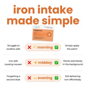
This square supplement ad template is built to sell an iron patch (transdermal-style iron support) by reframing supplementation as effortless. A clean white canvas is dominated by a bold, oversized or...
Free for 7 days — Cancel anytime
About This Template
This square supplement ad template is built to sell an iron patch (transdermal-style iron support) by reframing supplementation as effortless. A clean white canvas is dominated by a bold, oversized orange headline (“iron intake made simple”), immediately telegraphing simplicity and convenience. The product pack shot sits centered beneath the headline, while three horizontal comparison rows guide the eye down the page: each line pairs a pain point on the left (“struggle to swallow pills,” “pills causing nausea,” “forgetting a second dose”) with an orange pill-shaped time label (morning/midday/evening) featuring a red X and green check, then resolves with a benefit statement on the right (“simply apply the patch,” “works seamlessly,” “delivering iron effortlessly”). This structure is ideal for MOF consideration and solution-aware audiences: it acknowledges familiar frustrations, offers a clear alternative, and reduces perceived effort. Brands can customize by swapping the pack image, adjusting the three pain points to match their audience, and aligning the orange accent color with their identity while keeping the high-contrast check/X system for instant scanning.


