Gummy Supplement Curiosity Hook Ad Template - Square
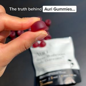
This square supplement ad template is built around a handheld gummy close-up that instantly signals “real product” and invites inspection. A finger-and-thumb hold a deep red, translucent gummy in cris...
Free for 7 days — Cancel anytime
About This Template
This square supplement ad template is built around a handheld gummy close-up that instantly signals “real product” and invites inspection. A finger-and-thumb hold a deep red, translucent gummy in crisp focus, while the branded pouch and scattered gummies sit softly blurred in the background—creating depth and directing attention to the hero piece. The headline “The truth behind …” paired with a rounded white label-style text box frames the message as a reveal, leveraging curiosity and novelty to stop the scroll at top-of-funnel awareness. The minimalist dark slate backdrop and high-contrast white typography feel clean and credible, supporting a trust-first positioning without needing heavy claims. Because the packaging is present but defocused, the layout works for both established brands and white-label sellers: swap the product name, adjust the pouch mockup, and keep the same “truth behind” angle to introduce ingredients, sourcing, or a key differentiator. This creative is especially effective for health-conscious shoppers who hesitate with gummies—showing texture and color up close reduces uncertainty and makes the product feel tangible and authentic.


