Personalized Multivitamin Comparison Ad Template - Square
This square comparison template is built for a personalized multivitamin or supplement subscription brand that wants to win consideration against “generic” competitors. The layout is a clean split-scr...
Free for 7 days — Cancel anytime
About This Template
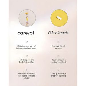
This square comparison template is built for a personalized multivitamin or supplement subscription brand that wants to win consideration against “generic” competitors. The layout is a clean split-screen: the left column highlights your brand with checkmark boxes, while the right column lists “Other brands” with empty boxes—instantly framing a clear winner without needing aggressive claims. At the top, simple pill visuals in circular frames reinforce the product category, and the light beige background with subtle dividers keeps the design clinical, calm, and trustworthy. Typography mixes a bold modern wordmark style on the left with a softer italic headline on the right, creating contrast while remaining premium. The messaging structure taps into simplicity and social-proof-by-format (checkbox validation), plus value savings (“half the price”) and reassurance (“certified,” “free app,” “tracks progress”). This is ideal for mid-funnel, solution-aware audiences comparing options. Customize by swapping the three benefit rows to match your strongest differentiators (e.g., third‑party testing, tailored packs, coaching) and adjust the right-side “Other brands” claims to mirror real objections you overcome.


