Vitamins New Arrival Ad Template - Square
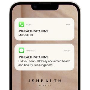
This square supplement ad template uses a smartphone mockup to mimic iOS-style notifications, turning the offer into an attention-grabbing “you’ve got a message” moment. Two large rounded notification...
Free for 7 days — Cancel anytime
About This Template
This square supplement ad template uses a smartphone mockup to mimic iOS-style notifications, turning the offer into an attention-grabbing “you’ve got a message” moment. Two large rounded notification cards sit on a warm beige background: a missed call from the brand and a follow-up message (“Did you hear? … is in Singapore!”), creating instant curiosity and a sense of novelty. The clean sans‑serif typography and ample white space keep it premium and readable, while the subtle phone frame adds realism without distracting from the headline. Strategically, this is a top-of-funnel awareness creative aimed at audiences who aren’t actively shopping for vitamins yet; the notification format interrupts the scroll and feels personal, like a direct update. It works especially well for market entry announcements, retail availability, pop-ups, or new distributor launches. Customize by swapping the sender name, the short message copy, and the location/launch detail; you can also add a small benefit line (e.g., “beauty-from-within”) or a simple “Learn More” button beneath the phone while keeping the minimal notification aesthetic intact.


