Bloating Supplement Social Proof Ad Template - Story
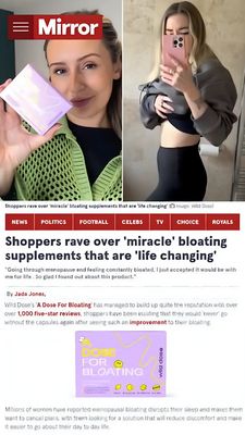
This 9:16 Story template is built to sell an anti-bloating supplement using an editorial, “as-seen-in-the-news” credibility frame. The top half uses a split-screen collage: on the left, a close-up of ...
Free for 7 days — Cancel anytime
About This Template
This 9:16 Story template is built to sell an anti-bloating supplement using an editorial, “as-seen-in-the-news” credibility frame. The top half uses a split-screen collage: on the left, a close-up of a woman holding a pastel product box; on the right, a mirror selfie that visually supports a body-comfort/waistline transformation claim. Below, a bold newspaper-style masthead (“Mirror” look), category tabs, and a large headline create instant authority, while smaller body copy blocks mimic an article excerpt and add room for proof points like review counts and improvement claims. The palette mixes strong reds and black type for trust and urgency, balanced by the soft lavender product pack that stands out as the focal CTA anchor. This creative fits mid-funnel consideration for solution-aware shoppers who already suspect bloating and want reassurance before buying. Customize by swapping the publication-style header, inserting real review metrics, and updating the product shot and headline to match your brand’s compliant claims and audience (PMS, menopause, IBS-friendly diets, etc.).


