Bone Broth Protein Comparison Ad Template - Square
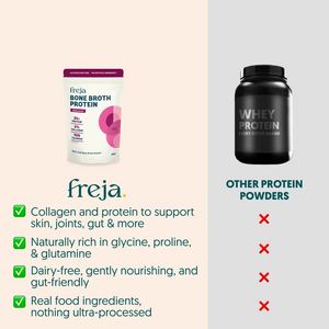
This square ad template is designed for supplements—specifically a bone broth protein powder—positioning it against “other protein powders” in a clear side‑by‑side comparison. The layout splits the ca...
Free for 7 days — Cancel anytime
About This Template
This square ad template is designed for supplements—specifically a bone broth protein powder—positioning it against “other protein powders” in a clear side‑by‑side comparison. The layout splits the canvas vertically: a warm cream panel on the left features the hero pouch and a stacked checklist, while a cool light‑gray panel on the right shows a dark, generic whey tub with repeated red X marks. This visual contrast makes the differentiation immediate even when scrolling. Typography is clean and modern, with large brand wordmark space and readable benefit bullets. The green check icons act as fast proof cues, reinforcing trust and reducing cognitive load. Strategically, it targets solution‑aware shoppers in the mid‑funnel: people already considering protein but unsure which type fits their goals. The comparison trigger and curiosity (“why is this better?”) move users toward consideration by highlighting joint/skin/gut support, amino profile, and dairy‑free positioning. Brands can customize by swapping product shots, revising bullet claims, and adjusting icon colors while keeping the high-contrast split that makes the argument persuasive.


