Electrolyte Mix Comparison Ad Template - Story
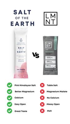
This 9:16 Story template is built for an electrolyte drink mix sold in single‑serve packets, using a clean side‑by‑side comparison to drive mid‑funnel consideration. At the top, a bold all‑caps headli...
Free for 7 days — Cancel anytime
About This Template
This 9:16 Story template is built for an electrolyte drink mix sold in single‑serve packets, using a clean side‑by‑side comparison to drive mid‑funnel consideration. At the top, a bold all‑caps headline (“SALT OF THE EARTH”) and a simple square logo block establish brand authority fast. The center features two packet shots separated by a large “VS,” making the competitive contrast instantly scannable on mobile. The bottom half turns the argument into a checklist: green check icons on the left and red X icons on the right, with short benefit statements that communicate differentiation at a glance (ingredients, usability, taste). The white background, navy typography, and small pink accent on the left packet create a clinical-yet-modern supplement aesthetic that feels credible rather than hypey. This structure works well for solution‑aware audiences comparing options, because it reduces decision friction and frames the product as the “obvious” choice. Swap in your own packet photos, update the claim rows to match your formula, and replace the logo block to fit any hydration or wellness brand.


