Focus Supplement Non-Adderall Claim Ad Template - Square
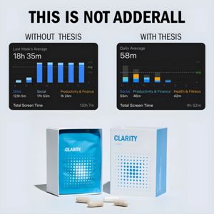
This square supplement ad template promotes a focus/productivity capsule brand by using a bold, contrarian hook at the top (“THIS IS NOT ADDERALL”). The layout is structured like a mini case study: tw...
Free for 7 days — Cancel anytime
About This Template
This square supplement ad template promotes a focus/productivity capsule brand by using a bold, contrarian hook at the top (“THIS IS NOT ADDERALL”). The layout is structured like a mini case study: two side-by-side screen-time analytics cards compare “WITHOUT” vs “WITH,” visually implying a dramatic shift in habits and attention. The dark UI panels with blue bar charts deliver a data-driven, tech-forward feel, while the clean light background keeps the overall design premium and clinical. At the bottom, a crisp product packshot (box + pouch) and a few capsules anchor the message in a real, tangible item. Strategically, this is top-of-funnel awareness for an “unaware” audience: the shock/curiosity trigger stops the scroll, the transformation claim suggests outcomes, and the aspiration of better focus and digital discipline nudges viewers to learn more. It’s easy to customize by swapping the comparison metric (sleep, tasks completed, study hours), updating the product name, and adjusting the chart colors to match any nootropic or wellness supplement brand.


