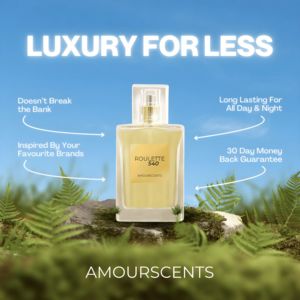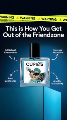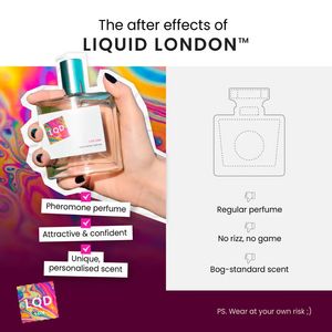
Pheromone Perfume Comparison Ad Template - Square
This square perfume ad template sells a pheromone fragrance through a bold, side‑by‑side comparison. The layout is split: on the left, a hand-held bottle cutout pops against a psychedelic, oil-slick r...
Free for 7 days — Cancel anytime
About This Template
This square perfume ad template sells a pheromone fragrance through a bold, side‑by‑side comparison. The layout is split: on the left, a hand-held bottle cutout pops against a psychedelic, oil-slick rainbow background, instantly signaling novelty and “new drop” energy. Under the bottle, three white label-style captions with pink check icons highlight benefits like attractiveness, confidence, and a personalized scent. On the right, a minimalist grey panel shows a simple bottle outline and three negative bullets with thumbs-down icons that frame “regular perfume” as bland and ineffective. The headline at the top (“The after effects of…”) sets up curiosity, while the cheeky footer note (“Wear at your own risk ;)”) adds playful provocation. Strategically, this is top-of-funnel awareness creative: it grabs attention fast, creates contrast, and makes the product feel like an upgrade without requiring technical claims. It’s ideal for audiences who buy fragrance for identity and social impact. Brands can swap the bottle, colors, and bullet points while keeping the high-contrast comparison structure that drives quick, scroll-stopping comprehension.