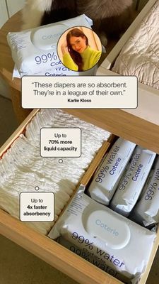
Wearable Breast Pump Comparison Ad Template - Story
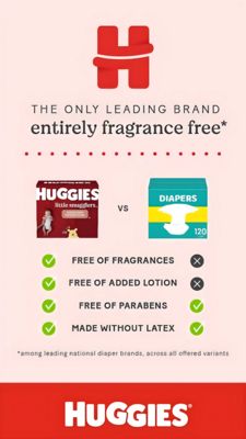
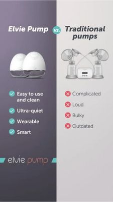
This 9:16 Story template is built for promoting a wearable breast pump through a clear side‑by‑side comparison. The layout is split vertically: a muted purple panel on the left highlights the modern w...
Free for 7 days — Cancel anytime
About This Template
This 9:16 Story template is built for promoting a wearable breast pump through a clear side‑by‑side comparison. The layout is split vertically: a muted purple panel on the left highlights the modern wearable device, while a clean light panel on the right shows a traditional pump setup. Large, bold headline typography (“vs.” centered in a teal circle) establishes an instant comparison frame, followed by checkmark and X icon bullet lists that translate benefits into quick, scannable decision cues. The design leverages convenience, modern tech, and comfort triggers—positioning the wearable as easy to clean, ultra‑quiet, and smart, while framing the alternative as complicated, loud, and bulky. This makes it ideal for mid‑funnel consideration where the audience is solution‑aware and evaluating options. The minimal visuals and high contrast icons help tired, time‑pressed parents grasp the value in seconds. Brands can customize by swapping product renders, updating the left/right claims to match feature priorities, and adjusting accent colors (teal icons and the “vs.” badge) to align with brand guidelines without losing readability.