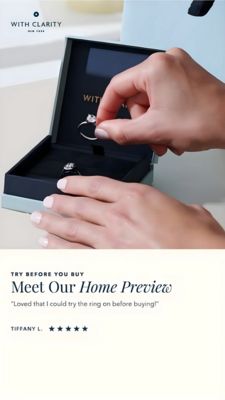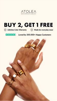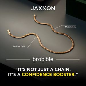
Pendant Necklace Comparison Sale Ad Template - Story
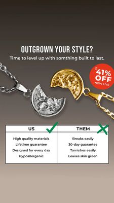
This 9:16 Story template is built for promoting a pendant necklace with a direct “us vs them” comparison angle. The top section uses a clean, bold all-caps headline (“Outgrown your style?”) on a neutr...
Free for 7 days — Cancel anytime
About This Template
This 9:16 Story template is built for promoting a pendant necklace with a direct “us vs them” comparison angle. The top section uses a clean, bold all-caps headline (“Outgrown your style?”) on a neutral gray gradient, creating instant attention without feeling busy. Center stage is a high-contrast product shot featuring two half-moon pendants—one silver, one gold—visually reinforcing premium metal finishes and everyday wear. A bright red circular discount badge (“up to 41% off”) injects urgency and makes the promotion unmistakable at a glance. The lower half switches to a structured comparison table with check and cross marks, listing durability and comfort claims (high-quality materials, lifetime guarantee, hypoallergenic) against common frustrations (breaks easily, tarnishes, skin turning green). This strategy leverages contrast and risk-reversal—ideal for top-of-funnel audiences who are unaware but skeptical about jewelry quality. Brands can customize by swapping the pendant photo, changing the discount value, and tailoring the benefit bullets to match their materials, warranty, and positioning while keeping the strong, scannable hierarchy intact.